Let's look at an example...
For any logo design, the first thing to do is talk to the client, in detail. A logo needs to represent them to the world, the designer needs to translate their ideals to an image.
On this project I had the pleasure of working with Kelly Chrisholm and George Fisher, we met to discuss their plan for the business, what the objective was, what inspired them to start it. I prefer to discuss these aspects first because they establish the attributes the client wants to project, and what they want the viewer to feel when introduced to the brand. Should they be projecting professionalism, or warmth? Should the viewer feel friendliness, or excitement?
Of course I also ask more general questions: Is there anything you want to avoid in this logo? Are there other brands that strike you as particularly attractive, and why? Have you considered color at all? I show some examples of logo archetypes to see if anything resonates.
George and Kelly identified that authenticity, professionalism, and accountability were their core attributes, that they wanted to project enthusiasm and confidence. There were some colors they wanted to avoid for brand recognition reasons. We established that an emblem or abstract mark style logo would be a good direction.
The company name would be Freedom Focused Coaching.
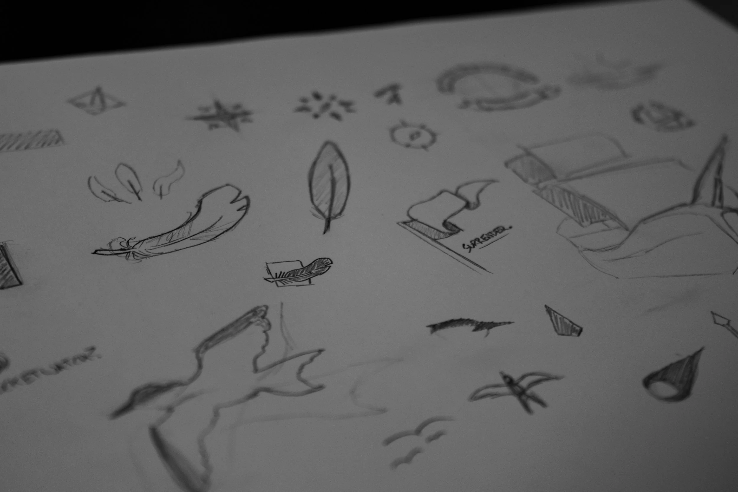
As I work through concepts, I try to follow through the most promising idea to avoid time spent towards a less-than-ideal result, though I will still bring those prototype ideas to the next meeting in case one sparks with the client. In this case I seized on to the maritime theme following our initial meeting, quite often defining elements that aren’t directly related to the business operation itself are the most important to establish identity, and set one company apart from the competition. It’s also not negligible that we live in a maritime society, where this business will be based.
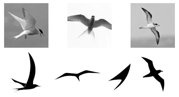
I tried birds. What’s more free and self supporting than a bird in flight? But people have different perceptions of sea birds. Seagull was never on the table but you can imagine some people might confuse that with say a tern or albatross. From a practical sense, in a simplistic stylized logo, a bird in flight either ends up looking like a check-mark, or overly anatomical.
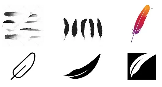
How about a feather? More simple, still reminiscent of flight. Overly simple began to appear leaf-like, adding more detail seemed to say “ragged” or “abandoned”. There is also a lot of prominent companies with feather logos, even in this space.
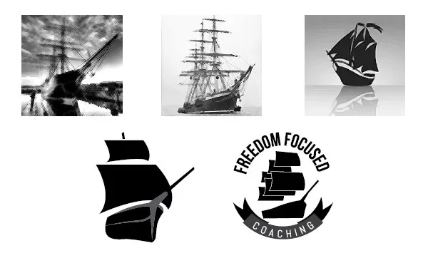
Maybe a ship? A common business analogy in “steering the ship”, what could be more confident than a ship cresting a wave? But I think you’ll find even a simplified ship is quite a busy image, and doesn’t translate well to the modern, clean aesthetic we’re aiming for.
What I believe worked the best as a concept is the compass. It still relates to steering the ship, but it fits in many more ways too. A compass gives direction, just like a coach. It helps you find your way out of the woods. It’s a very recognizable symbol.
Here was my strongest concept. The icon of the compass is styled to also bring to mind a sunrise on the horizon. It shows direction, upwards, forwards, North. The needle is reminiscent of a caliper symbolizing measurement and progress. The increments vaguely represent a clock, as in the time-frame nature of the coaching program.
A centered balance expresses confidence. A simple and clean design reinforces modern and fashionable. Keeping things open we reinforces the idea of freedom, but the circular composition helps it still work as an emblem.
In the end we refined the color a bit together, and I delivered the full set of files with variations. We established the styles and standards for the brand beyond the logo. The next step would be to create the documents for use in the course with the new branding in mind.


