Halifax Transit concept Application
As part of a UX learning exercise, I decided to go through the process of designing a public transit application concept for the city of Halifax. I chose this project in part because I am familiar with the use case as a transit user myself. In speaking with friends, we all have different opinions on which solutions are best, but we all agree that the monthly pass or tickets are less than ideal, and that a digital product is necessary to use the transit system effectively.
Because this was a solo project for practice, I didn’t have all the advantages of access to a user base to test with. To make for at least a half-decent UX exercise, I wanted to stick with something familiar enough to use myself as a proxy user. It’s always good to look at things from a user’s perspective while designing in any case.

Testing a new tool: Figma
The tool I know best is Adobe XD, but I would prefer to be familiar with the pros and cons of any given option. This was a great opportunity to learn and compare Figma to XD. Both are relatively new programs regularly adding new features and capability, so it’s fun to see how they improve over time.
Research Phase
What needs did I recognize?
Obviously I had my own opinions about needs from my experience as a user, and from talking to a handful of friends about their experiences as well. Personal opinion is not a very solid basis for user experience design however, so I looked at how the competition serves a few common user flows.
Google Maps
To no surprise Google had some great ideas I hadn’t really considered at first, and I added them to my list:
Showing weather in connection to travel
Tracking travel history for reference of where you’ve been
Showing events and reservations from your calendar
The ability to casually explore nearby locations for restaurants, hotels, etc.
Because Google is a widespread service provider covering things like detailed maps, weather, and your events schedule, it is easy for them to include these very helpful features.
Transit
This application is one most of my friends preferred (though I just use Google Maps instead) so it was very interesting to explore. It seems like they hit their goals really well, and the app was a pleasure to use. They cover almost all the features I had planned and the transit specific ones from Google, but interestingly also connect with Uber and Atlantic CarShare to offer alternatives to city transit, which is a great idea and easy to implement.
MonTransit
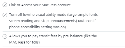
This app had a lot less market share than the previous two, and I have to be honest I am not surprised after using it a bit. Without getting super critical I can just say they’ve made a few unusual choices, like showing all the bus routes in numerical order as an array. Visually compelling, but I can’t really imagine what the use case for that would be. Nevertheless they had two excellent ideas the others didn’t: showing the local agency social media (i.e. Halifax Transit’s twitter for service interruptions etc.) and kicking the user on to other platforms for things the app can’t serve (such as pushing you to Google Maps when selecting the option to plan a route in advance). This would work well for my ideas about serving weather, social media, CarShare and MACPass without having the implementation strength of Google at my back.
Considering User Flows and Use Cases
Red Route Map
Once I had a good idea of the features I wanted to represent, I plotted them on the basis of frequency of use, and how widespread the use of that feature would be. I made adjustments as I worked, but I found this very useful for planning which features should be presented up front.
User Flows
People have very different transportation needs, I had created a couple user flows for assessing the competing apps, but it’s always good to consider fringe cases as well, such as someone who only opens this up twice a year for a CarShare while their own car is in the shop.
Design Phase
Wireframing
My first wireframe used a different navigation method with sub menu fly outs. I decided this was a bit less intuitive than I wanted after researching common UI patterns for this problem. I switched to a static lower navigation that was consistent with how most common apps work, in order to keep things familiar for even less tech-savvy users.
Originally many of the pages were planned to have supporting images, such as a rainy scene on the weather page. Ultimately I decided these weren’t adding much value, and removed them for a simpler approach. My goal was to have the map nearly always be shown even if only as background, to give the user a sense of stability and avoid feeling lost. All the pages and cards are a secondary layer to the base: your location. Where you are and where you’re trying to go is the core of a transit app.
Prototyping
In aiming to keep things as usable as possible it was important to make the interactions flow logically and consistently.
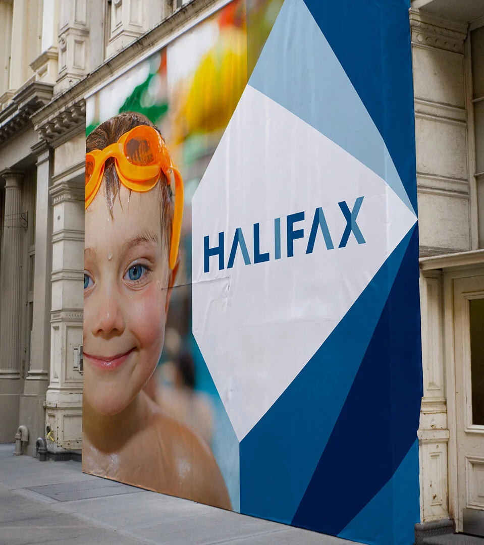
The Halifax City Brand
With a final though to aesthetics, I am envisioning this app be provided directly by the city of Halifax, so for any branding choices I would be looking to their brand standards produced by Revolve.
Prototype Walkthrough
Review Phase
What would I improve?
Obviously there are more screens to make, even within the current design. It’s likely that in that process I would uncover improvements to the product as a whole.
In the final product, accessibility would be a primary goal. I have kept to a minimum clickable area standard of 44px to make sure no special dexterity is required, but for this user base specifically I would want to make sure the visual contrast and sound design was carefully tuned because many transit users are visually impaired. Testing for this, and generally user feedback, I’m sure would result in a ton of improvements.
Aesthetics
I think the visual design here could be more strongly branded. Right now I have left things simply functional as this was more of a UX exercise for me than a UI or Brand Implementation one. Those are certainly part of UX, but for now pulling from Google’s Material Guidelines offered a great base.

Review of the Tool
It was fun to try out an alternative to Adobe XD, and I found overall they are extremely comparable. Lacking the “Repeat Grid” function from XD slowed me down a bit, and the way layers are arranged in Figma can lead to disorganization if you aren’t careful (XD collapses and organizes more automatically).That said, Figma makes managing styles and effects very quick and easy. The “Clean Up” arrange functionality was very intuitive and saved time. Basic CSS identification is built in, something XD requires an addon to do. The way symbols work is also quite good, and I believe XD is currently adopting this strategy.